UX Design · Fintech · Lead Designer

From a static benefit page to a personalized, guided benefit

Fidelity’s Student Debt Retirement dashboard had barely changed since the benefit launched in 2019. Participants enrolled, then couldn’t tell what the benefit was worth or what to do next. I led the redesign that turns it into a guide, going live January 2027.

Jump to the design
100%
task success in usability testing, across 15 sessions and 5 tasks
3×
more participants could explain how the match works
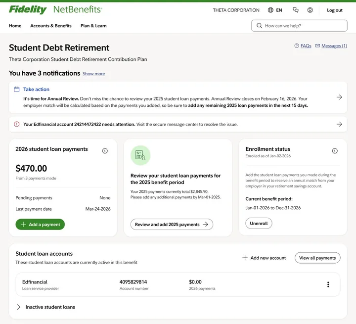
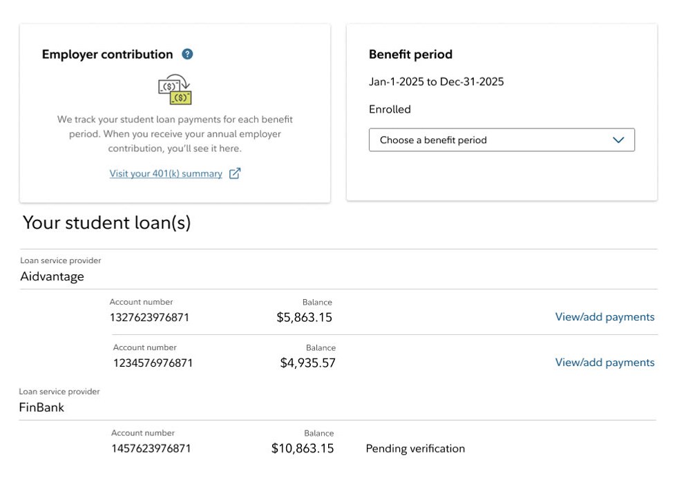
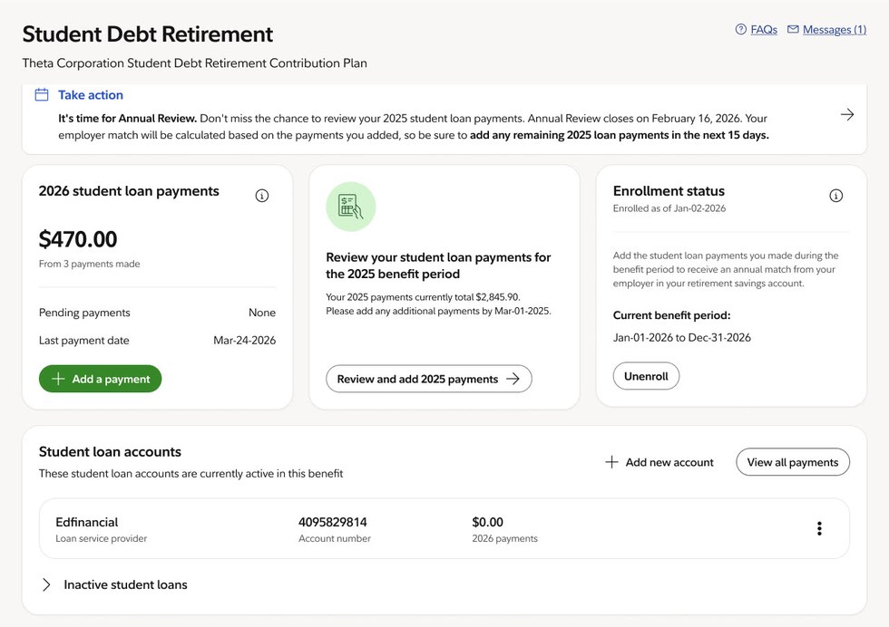
The 2019 dashboard, condensed: an empty employer contribution card, a benefit period selector, and a plain list of loans with account numbers, balances and a pending verification status. The 2027 dashboard, condensed: the benefit name, an annual review notification, three summary cards, one student loan account and a collapsed inactive loans section.

Sweeps slowly on its own. Drag, or use the arrow keys, to take over.

TL;DR

THE PROBLEM

The dashboard was a static page: a balance, a loan list and generic alerts. Participants enrolled, then stopped engaging, and many missed their full employer match.

WHAT I DID

I reframed the page around the questions participants kept asking, tested it across three research studies, and rebuilt it on Fidelity’s design system.

WHAT’S LAUNCHING

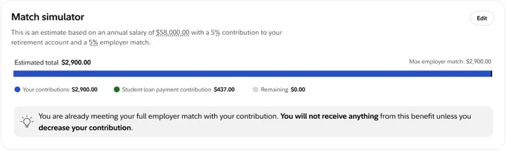
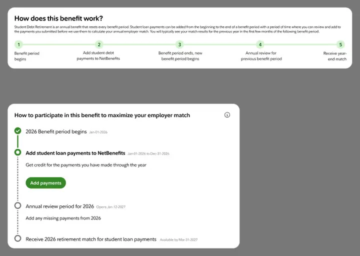
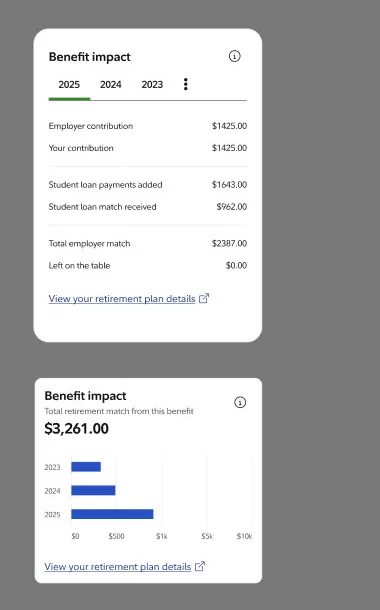
Level 1 goes live January 2027 with personalized guidance and loan self-service. The benefit timeline and match simulator follow in mid to late 2027.

01 · CONTEXT
A benefit page that stood still

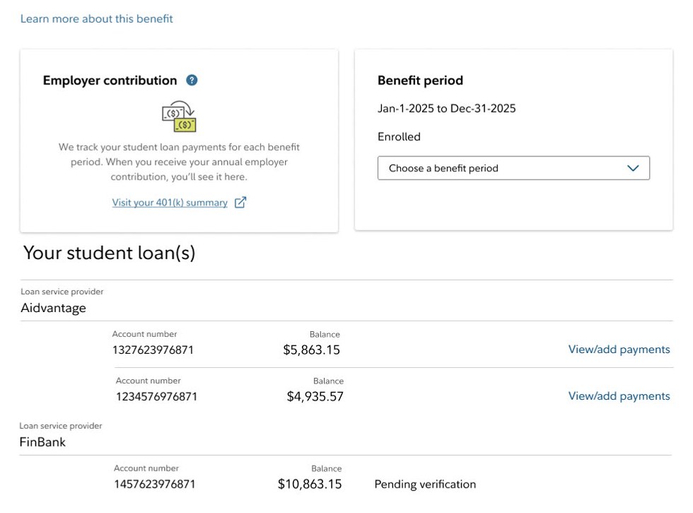
The 2019 dashboard with four numbered problem areas: the missing benefit name, an empty employer contribution card, identical loan actions, and a pending verification status with no next step.

Where it started

Student Debt Retirement lets participants count student loan payments toward their employer’s retirement match. Since 2019 the dashboard had barely changed: a balance, a list of loans, and alerts pointing to secure messages.

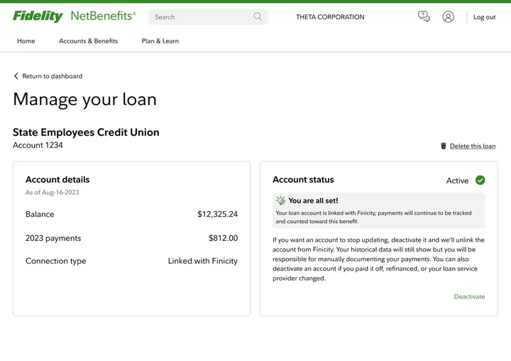
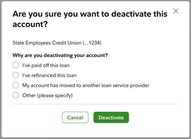
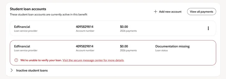
Participants couldn’t remove or update a loan, couldn’t see their match, and didn’t know when to act. The result was calls to Participant Services, missed matches, and a benefit people enrolled in but didn’t understand.

  1. No benefit name. The page says “Learn more about this benefit” and nothing else.
  2. The employer contribution card has no amount, no dates and nothing to act on.
  3. Every loan says “View/add payments”, so nothing signals which loan needs attention.
  4. “Pending verification” and “Ineligible loan” come with no explanation or next step.

02 · HOW I FRAMED IT

From static page to guided benefit

The static page answered one question: what’s on file. Participants were asking different ones. Which benefit is this? What do I do next? Is it worth it for me?

Leadership pushed us to get visionary first, then step back to what could ship. So I designed the full guided experience, then split it into levels: guidance and loan self-service first, the timeline and match simulator next.

STATIC PAGE

  • Balance
  • Loan list
  • Generic alerts

Answers: what’s on file?

GUIDED BENEFIT

  • Which benefit is this?
  • What do I do next?
  • Is it worth it for me?

Answers the questions participants actually ask

Timeline from 2023 to 2027 in three rows. Design system: the 2019 launch system, then 2024 Secure 2.0, then the Fidelity Design System. Research: a 2023 benchmark with 7 participants, 2024 usability with 15 sessions across 5 tasks, and 2025 interviews on the redesigned summary. Research also includes 2026 work on the match simulator and 401k product integration, which is ongoing. Direction: linked versus manual loans were dropped early, as was the timeline for Level 1; snapshot cards based on engagement, including the seasonal top cards, looped back into the main line and became today’s card row; the payment track card went into the final; match percentage was reshaped and carried forward; Level 1 goes live January 2027, and key dates, the match simulator and benefit impact follow in mid to late 2027.HOW THE WORK MOVEDFour years, three design systems, and a lot of dead ends20232024202520262027DESIGN SYSTEM2019 launch system2024 Secure 2.0Fidelity Design SystemRESEARCH2023 benchmark7 participants2024 usability15 sessions, 5 tasks2025 interviewsredesigned summary2026 research, ongoingmatch simulator, 401k integrationDIRECTIONSnapshot cards based on engagementPayment track cardLinked vs. manualMatch percentage, reshapedTimeline, droppedLevel 1 · Jan 2027liveMid–late 2027: key dates,match simulator and benefit impactDirection we droppedDirection that carried forward
  • Design systems: the 2019 launch system, then 2024 Secure 2.0, then the Fidelity Design System.
  • Research: a 2023 benchmark (7 participants), 2024 usability (15 sessions, 5 tasks), 2025 interviews on the redesigned summary, and 2026 research on the match simulator and 401k product integration, which is ongoing.
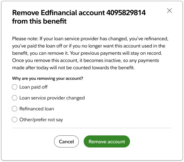
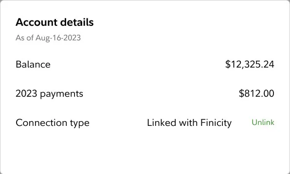
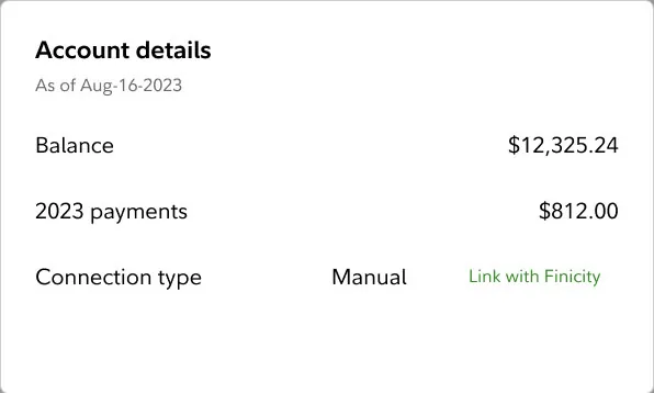
  • Dropped: linked versus manual loan labels, and the timeline for Level 1.
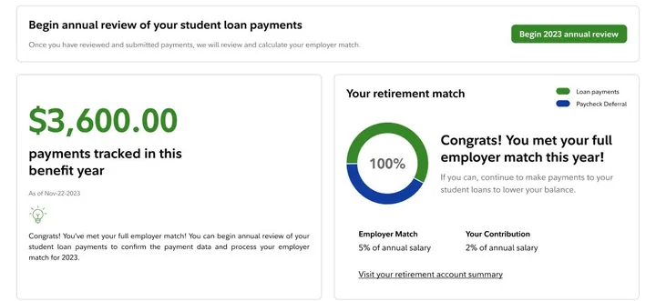
  • Carried forward: snapshot cards based on engagement, including the seasonal top cards, became the three-card row on today’s dashboard, with a next best action added. The payment track card went into the final.
  • Reshaped: match percentage, carried forward as the benefit insight card.
  • Level 1 goes live January 2027; key dates, the match simulator and benefit impact follow in mid to late 2027.

HOW RESEARCH SHAPED IT

2023 · BENCHMARK

7 participants on the current dashboard. Every core task scored severe or moderate.

2024 · USABILITY

15 moderated sessions across five tasks: add a payment, add a loan, remove a loan, unenroll, re-enroll.

2025 · INTERVIEWS

With the redesigned summary, participants could judge whether the benefit fit their situation.

03 · KEY SOLUTIONS

What we tried, and what won

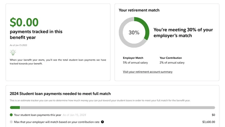
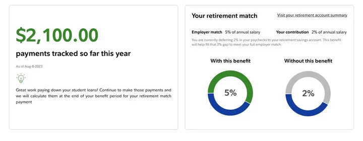
Frames from the iterations behind the dashboard. Scroll, and it narrows to what’s launching. Pick a theme to see how it ended.
THE TOP OF THE PAGE

The most impactful design elements

Based on research, these design elements contributed most to user engagement and benefit comprehension.
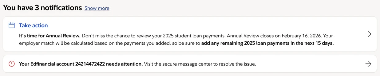
You have 3 notifications. A Take action notice that it’s time for Annual Review, with the closing date, and a second notice that an Edfinancial account needs attention.

1 · Notifications

One place for what needs you

Came from generic alerts. The audit showed alerts already overwhelmed people.

Why it won The most time-sensitive item leads and says Take action. An account problem sits right under it. Each is one sentence with one arrow, so nothing needs a second alert.
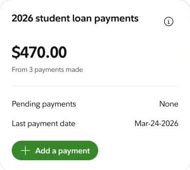
2026 student loan payments card: $470.00 from 3 payments made, pending payments none, last payment date Mar-24-2026, and an Add a payment button.

2 · Student loan payments

Your payments, and one thing to do

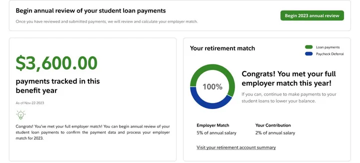
Came from the 2023 snapshot card that tracked payments.

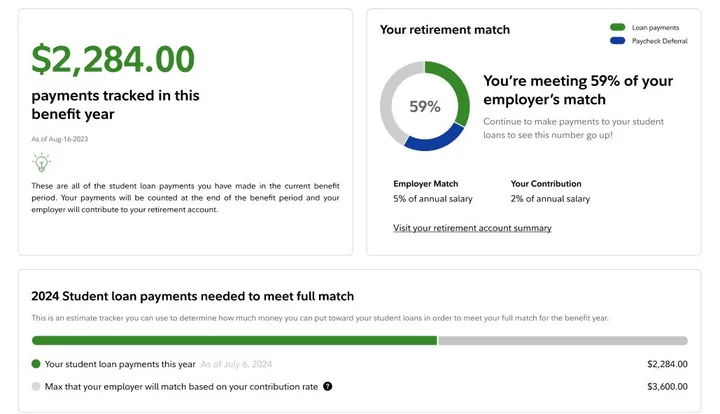
Why it won The year’s total stays big and plain. Pending payments and the last payment date sit beneath it, and Add a payment is the single action, so it’s clear what counts and how to add more.

3 · Dynamic message card

Tells you what to do now

Came from the snapshot cards, with a next best action added in the context of the snapshot data.

Why it won It changes with where you are in the period. During annual review it asks you to review and add last year’s payments, with one button. A hierarchy model decides which action leads.

What went wrong, and what I traded

  • The design system changed twice, so concepts were rebuilt.
  • Seasonal cards were tested and folded into the snapshot cards.
  • The full vision was bigger than what could ship first.
  • Vision first, then cut: kept the story, but showed more than Level 1 delivers.
  • Ship early, fold in later: value sooner, but each feature works in two shells.

04 · WHAT’S LAUNCHING

One vision, launching in phases

Designing the whole experience first made it easier to cut scope without losing the story. Each phase stands on its own, and the early ones fold into the new dashboard.

  1. AUG 2026

    Features that ship early

    New experiences, like adding a loan, ship on the current dashboard first, then fold into the new one.

  2. JAN 2027

    Level 1 goes live

    The new dashboard: benefit name, next best action, and loan self-service.

  3. MID TO LATE 2027

    Personalization cards

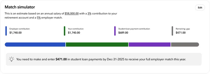
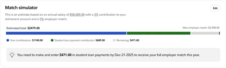
    Benefit timeline, impact insights and the match simulator, layered on top of Level 1.

Results will be added after Level 1 launches.

05 · KEY LEARNINGS

Three things I’d take into every project from here.

01

Comprehension Must Be Designed

Clear content and visual scaffolding aren’t polish — they’re the core of the product. Without comprehension, engagement is impossible regardless of how well the feature works.

02

Personalization Transforms Perception

Integrating real contribution data and showing benefit fit in context of each participant’s situation turned an abstract benefit into something that felt relevant and worth acting on.

03

Design the Vision, Ship in Levels

Designing the full guided experience first made it easier to cut scope without losing the story. Each level stands on its own and sets up the next.

Next project

Benefit Enrollment Redesign

View next case study