Show the answer, not the math
A verdict like "Enough to finish" answers the real question, with the numbers one step away.
Validate: How accurate do estimates need to be before people trust them?
Personal project · AI agents · Product design · Concept
AI tools are starting to show how much usage you have left. They still don’t predict what a task will take, or help you decide what to trade off when you’re running low. I designed a task usage predictor that estimates the cost up front and helps people choose how to finish the critical work, right in the conversation.
Jump to the design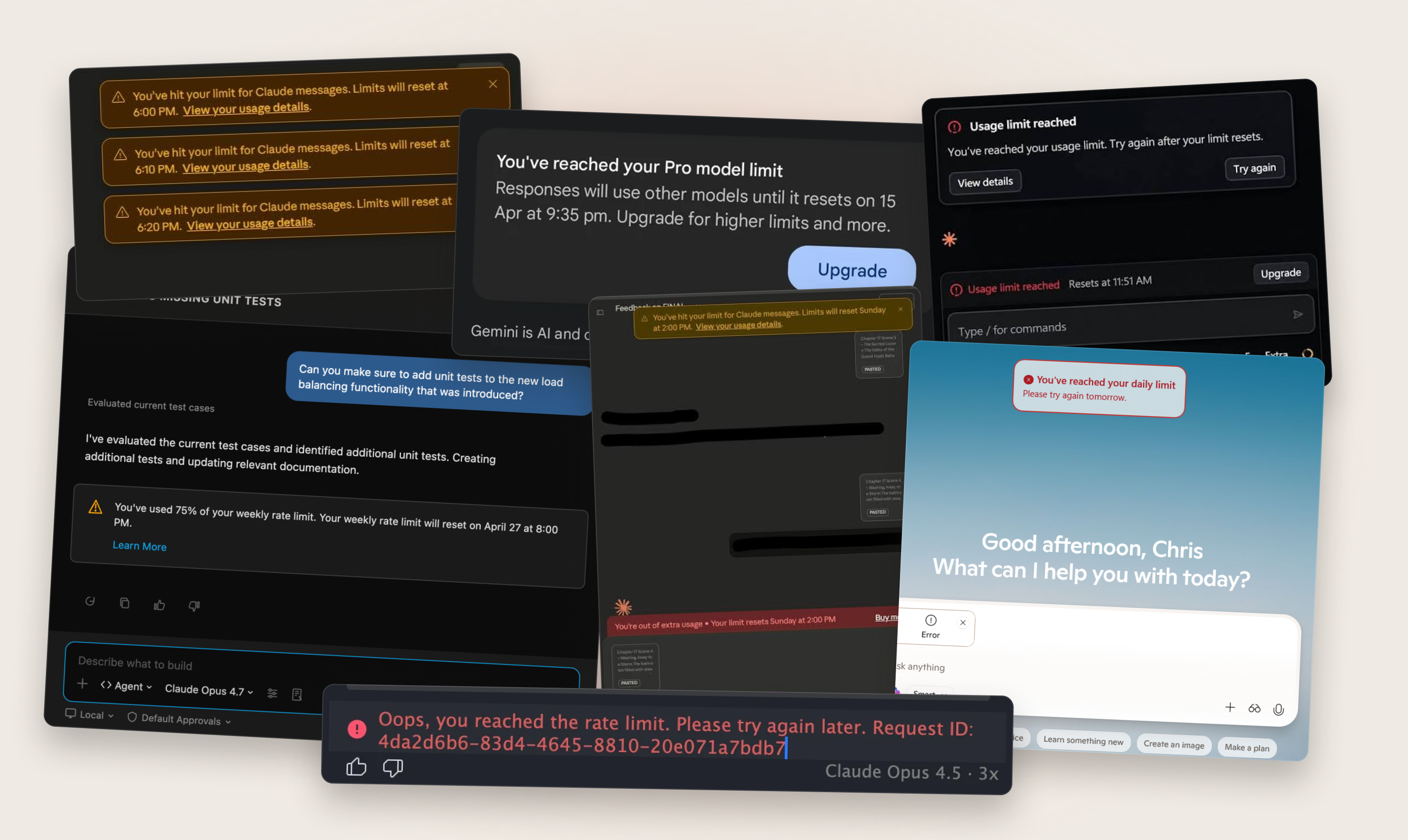
Agents spend your usage for you, across several tools. You can see your balance, but not what a task will cost, so you find out it was too much only after the task stops.
I designed a task usage predictor that helps people make tradeoffs: an estimate before you run a task, a verdict while it runs, limits for every connected tool, and options to finish the critical work instead of failing, like batching, deferring or saving a checkpoint.
Tools show your balance and warn you at the limit. None estimate what a task will cost, and when you’re running low, the only choices they offer are upgrade or buy more.
01 · DEFINING THE SPACE
Every request to an agent spends usage, but you don’t see the price until afterward. Tools are getting better at showing your balance. They still don’t show what a task will cost, or give you any say in how it’s spent.
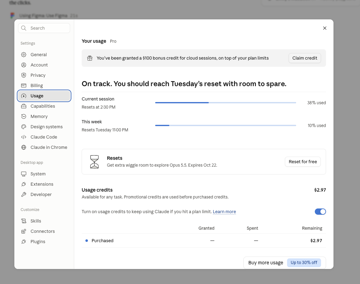
I couldn’t tell what a request would cost before I sent it. Checking meant leaving the conversation for settings, and even there I only saw a balance, not a price.
When I did worry about a usage limit, I asked the agent to do less, which made its work worse, without knowing whether I needed to.
Some reasons for hiding cost are fair: the cost of a request is hard to predict, and a meter that’s always visible can make people ration.
I see one clear reason a business would run the system as it does today: when people run out of usage mid-task, they are more likely to pay for more. Showing the cost earlier moves that first signal to a moment when there’s still time to choose.
Tools now show your balance, a forecast, even a ring near the limit. The message they lead with when you run out is an upgrade.
None show the cost of the task you’re about to run, and none give you a choice beyond buying more.
02 · TOOL AUDIT
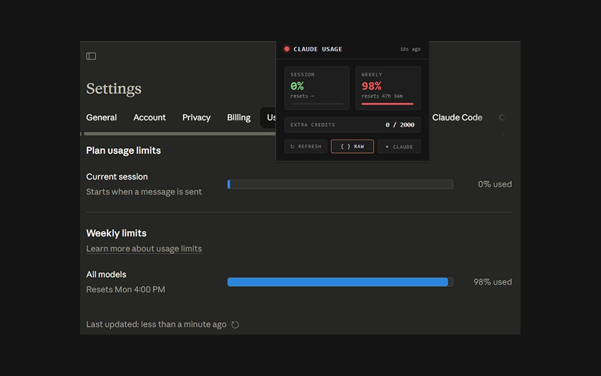
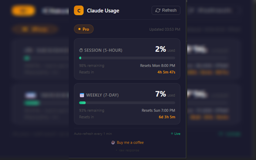
I audited six AI tools and in doing so found examples of trackers people have built for themselves.
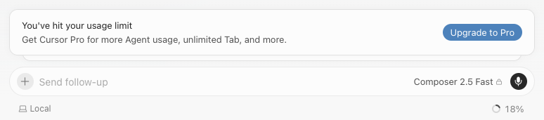
Every tool shows a balance or warns you at the limit. None estimate what a task will cost before you run it, and none offer choices beyond upgrading.
The best in-context patterns are in developer tools. None estimate what a task will cost before you run it. This felt like a design opportunity.
| Tool | Where usage lives | Warns before limit? | In-context indicator? | Estimates task cost? | Notes |
|---|---|---|---|---|---|
| Claude (app) | Settings → Usage: session and weekly bars, plus a pace forecast | Pace forecast in Settings; notice near the limit | Yes — ring in the composer near the limit (Sep 2026) | No | Now shows your balance, a forecast and a ring. Suggested actions: Upgrade or Buy more. |
| Claude Code | /usage command; limits can be piped into a customizable status line | Only if you build it | Opt-in, via scripts | No | Open GitHub feature request asks for in-CLI usage and threshold alerts to avoid mid-task cutoffs. |
| ChatGPT | No dedicated usage page in the chat app | No — banner when you hit a cap | No | No | Text chats uncapped since Aug 2026; images, Deep Research, agent and Codex still capped. You learn by hitting them. |
| Cursor | Web dashboard | Indicator appears after ~50% used | Yes, once past halfway | No | Limit banner leads with an upgrade CTA. Popular tracker extension was abandoned because pricing changed too often. |
| GitHub Copilot | Copilot icon in VS Code status bar → usage % | Budget alerts at 75 / 90 / 100% | One click from status bar | No | Moved to usage-based AI credits in June 2026. Users have asked for remaining balance directly in the editor. |
| Gemini | Profile menu → usage view | Yes — in-chat message near limit | Only near the limit | No | Compute-based limits: 5-hour refresh inside a weekly cap. Warning names the reset time. |
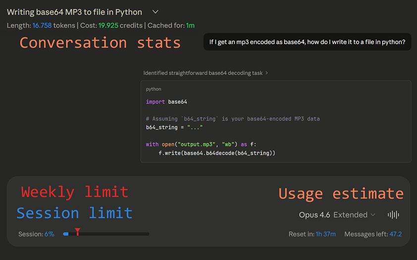
In my audit, I found I wasn’t the first person to surface this issue. Menu-bar apps, browser extensions and command-line status lines all exist as user workarounds to a product gap. They prove the need, but they sit outside the conversation and don’t feel integrated with the product. I felt there was room to explore more intuitive solutions.
03 · HOW I FRAMED IT
I rebuilt the Claude chat interface in Figma (with Claude) to match the real product and ideate on potential solutions with the real thing.
Mapped from my own experience: confident, then uneasy, interrupted, rationing, and blocked. The after journey ties each moment to the feature that changes it.
CURRENT STATE
Based on my own experience running a multi-step design task with Claude and the Figma connector. Evidence cards point to the screenshots I captured.
| Start the task | Work in flow | Start to worry | Go check | Ration blindly | Hit the wall | |
|---|---|---|---|---|---|---|
| Doing | Ask Claude to build a design in Figma. | Agent runs many Figma calls; I watch it work. | Notice how many calls it is making. No usage shown anywhere in the chat. | Open Settings → Usage in a modal, several clicks away. Figma’s limit isn’t shown at all. | Tell the agent to “do less pulls” so I don’t get blocked. | In Cursor: “You’ve hit your usage limit” mid-task, with an upgrade button. |
| Thinking | “This should be quick.” | “Great, it’s moving.” | “Am I close to a limit? Which one?” | “38%… so was I worried for nothing?” | “I’ll just ask for less and hope.” | “I was in the middle of something.” |
| Pain point | — | Cost is invisible while work happens. | No way to tell which tool will run out first. | Checking breaks flow; data is session-wide, not task-specific. | Rationing without information makes the agent do worse work. | Work stops mid-task. I’ll have to remember what I was thinking later. |
| Evidence | — | — | My chat: “I don’t want to get blocked by the limit.” | Settings → Usage modal screenshot. | My chat: “Try to optimize so we are doing less pulls.” | Cursor limit banner. |
| Feeling | ||||||
FUTURE STATE
The same task, with the meter built into the flow. Each step names the concept feature that changes the moment.
| Start the task | See the cost first | Work in flow | Pace check | Things get tight | Finish | |
|---|---|---|---|---|---|---|
| Doing | Ask Claude to design an app’s onboarding screens in Figma. | Pre-flight card: “likely 8–12% of your session.” Choose Run it or a lighter version. | Ring beside the model picker updates quietly. No clicks needed. | Progress panel shows “Enough to finish” and flags that Figma will run out before Claude. | Agent offers to batch Figma edits or skip screenshot checks, or to resume after reset. | Receipt: “Used 11%, estimated 8–12%.” |
| Thinking | “This should be quick.” | “OK, I know what this costs.” | “I can see where I am without looking for it.” | “Good to know it’s Figma, not Claude.” | “I can still get this done.” | “The estimate was right. I’ll trust it next time.” |
| Concept feature | — | Pre-flight estimate (D) | Ambient ring (A) | Verdict + limits across tools (E2, E11) | Cheaper paths + resume after reset (E6, E8) | Receipt (E9) |
| Feeling | ||||||
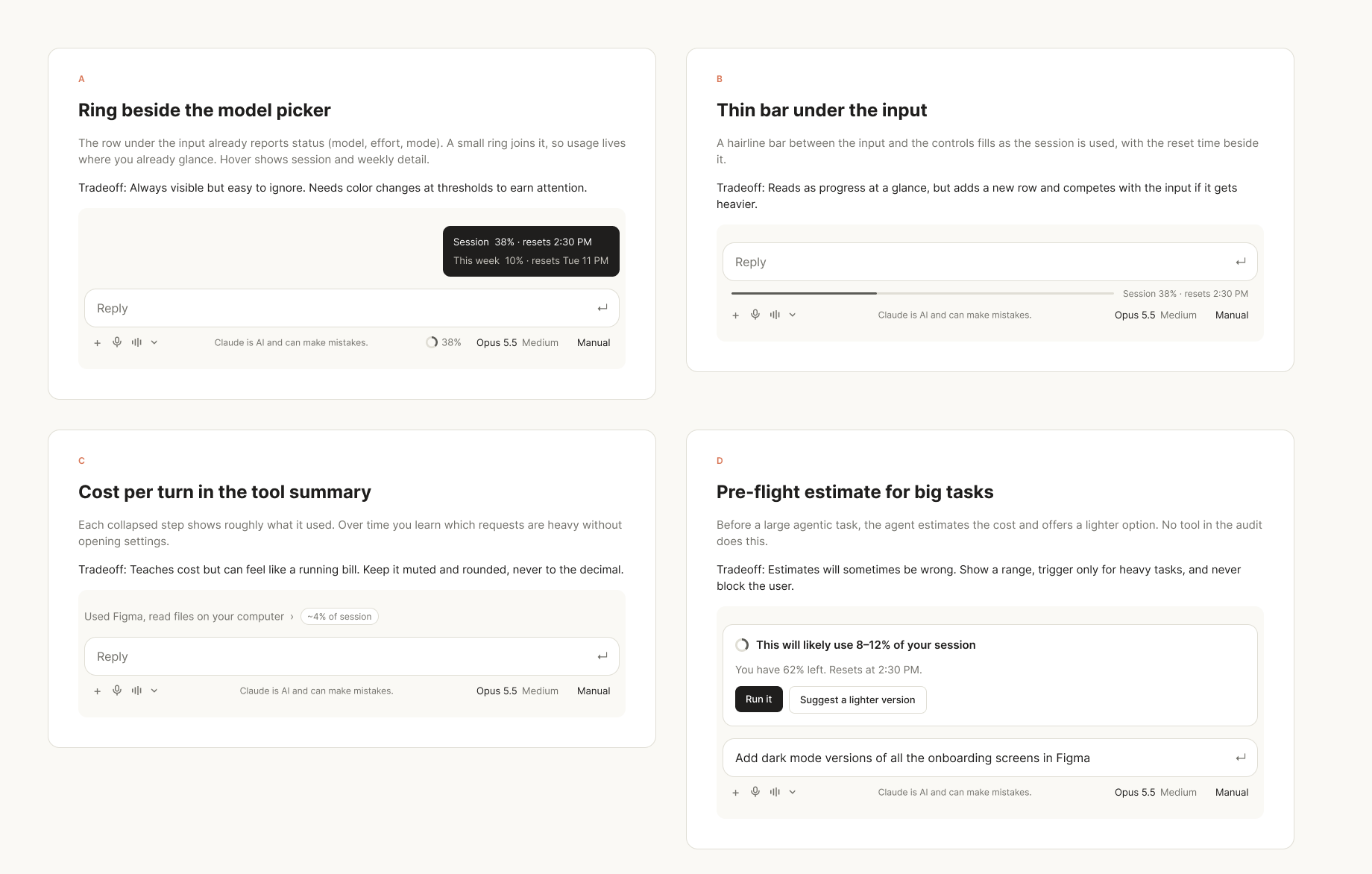
I began the project assuming the constraints of the existing Claude UI (my preferred agent). I explored various placement options and visual treatments that match Claude’s visual interface language and existing patterns.
I landed on placement under the chat input since it already reports the model and mode. A small ring fit into that container without adding any real estate cost. A bar under the input added a row that competed with typing.
Once a request is submitted in the chat input, most agents have a progress panel in the right-hand corner for larger, multi-step tasks, offering transparency at various steps.
I wanted to build on the trust that panel establishes by adding another layer of visibility to agent actions. How might I show usage limits within the existing progress panel?
I wanted directions that help you finish your query, not just warn: a plain-language verdict, cheaper ways to complete the task, resuming after a reset, and a receipt that shows whether the estimate was right.
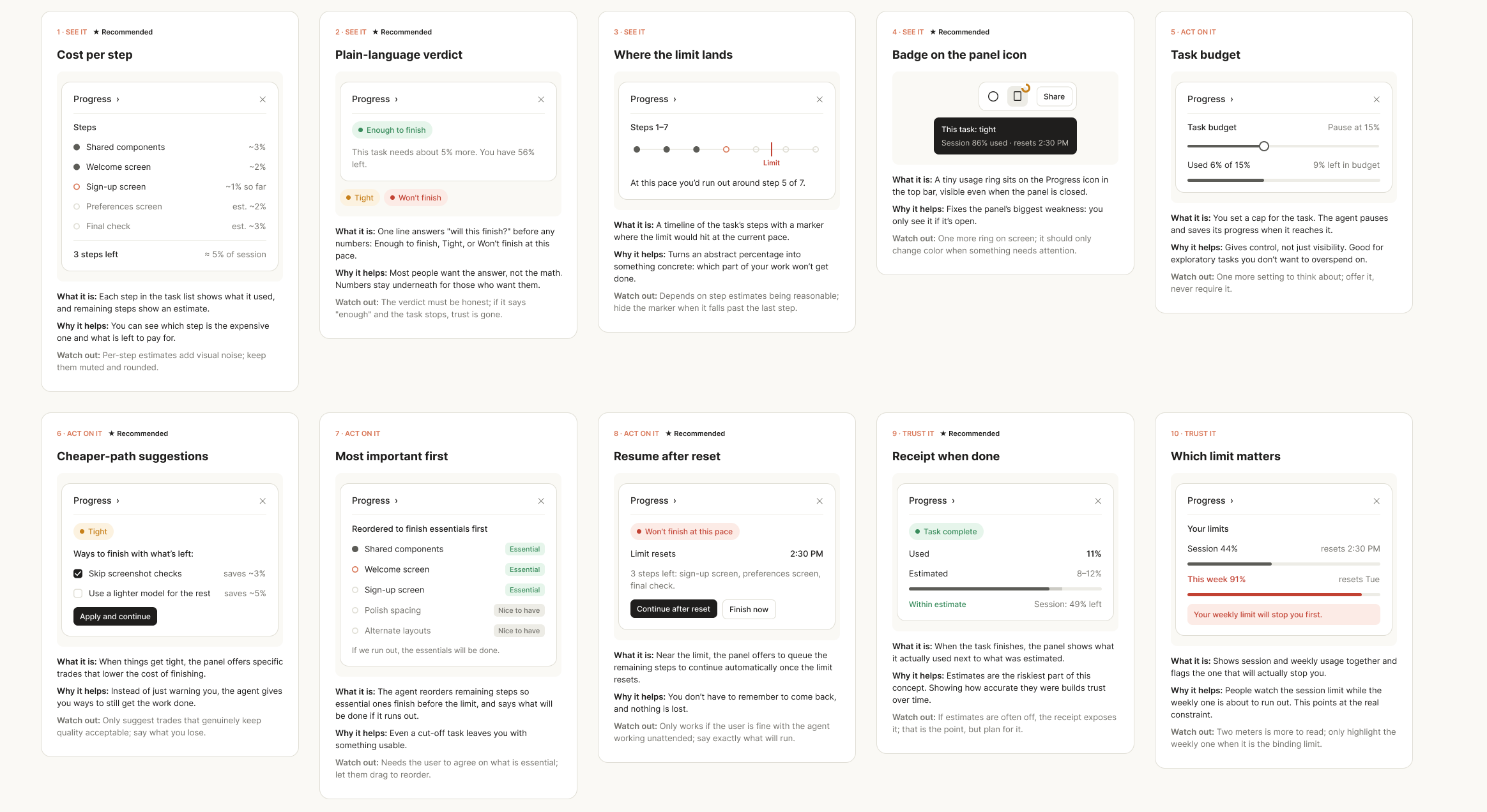
When I worried about limits, it was usually the connected design tool, not the one I was working in. So I designed a panel that tracks every tool the agent uses and names the one that will run out first. I also accounted for edge cases, where a tool may not share usage data.
None of the tools or trackers I audited do this.
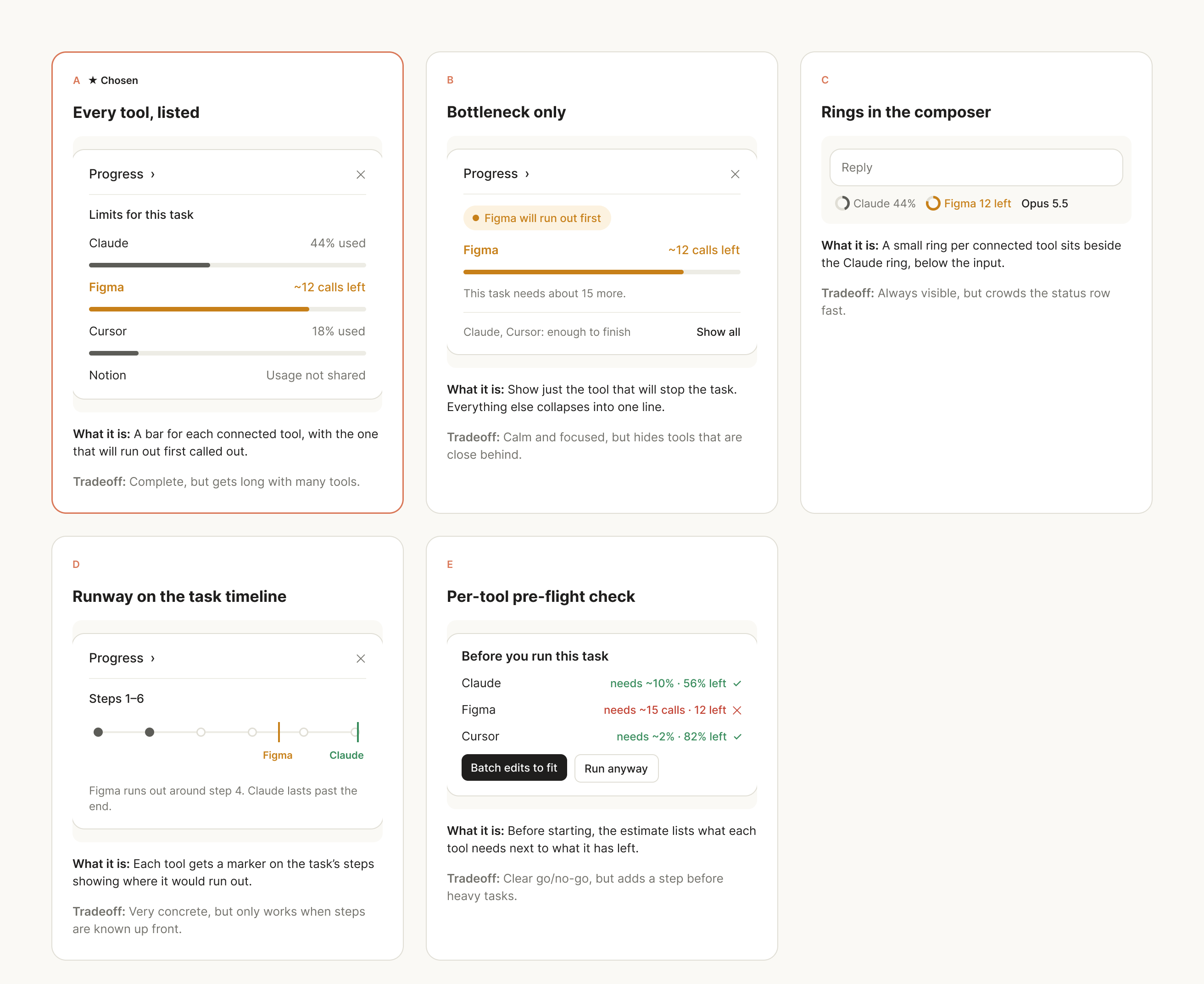
04 · THE DESIGN
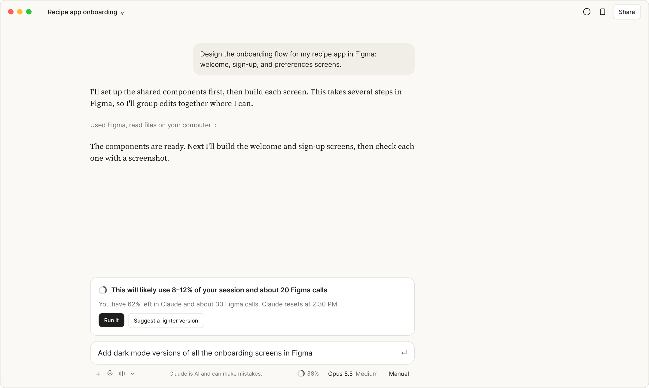
Each moment answers a question people have mid-task: what will this cost, am I on track, which tool will run out, and how do I still finish?
Before a heavy request, the agent estimates what it will use as a range, across itself and every tool it will call. Run it, or ask for a lighter version. It never blocks you.
Replaces: guessing, and rationing requests just in case.
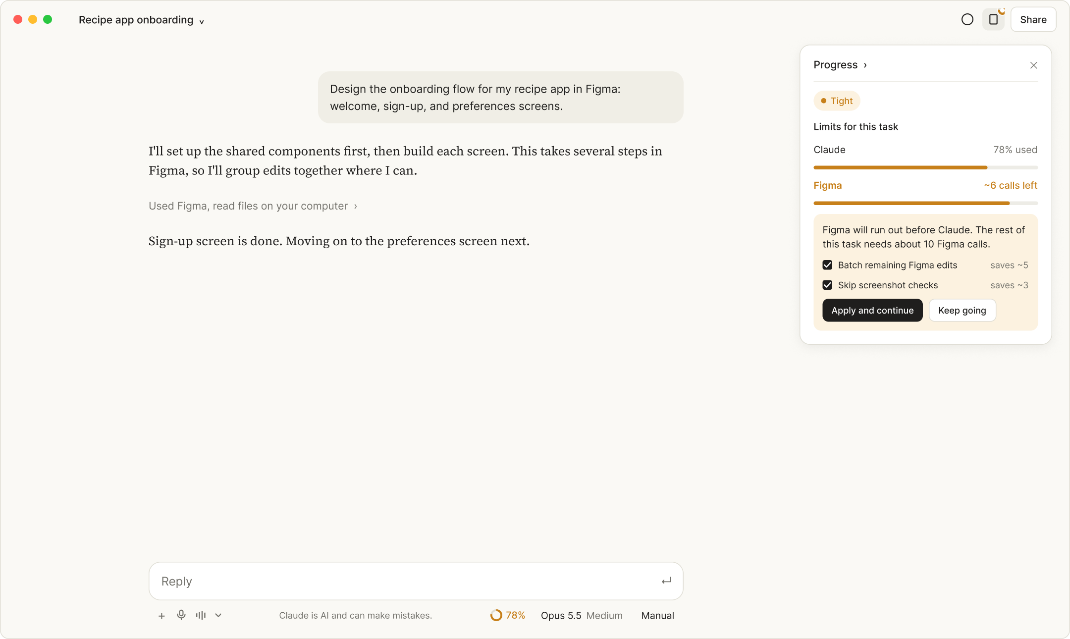
The Progress panel leads with Enough to finish, Tight, or Won’t finish. When it’s tight, it names the tool that will run out first and offers trades to still finish, like batching edits.
Replaces: finding the bottleneck only after it stopped you.
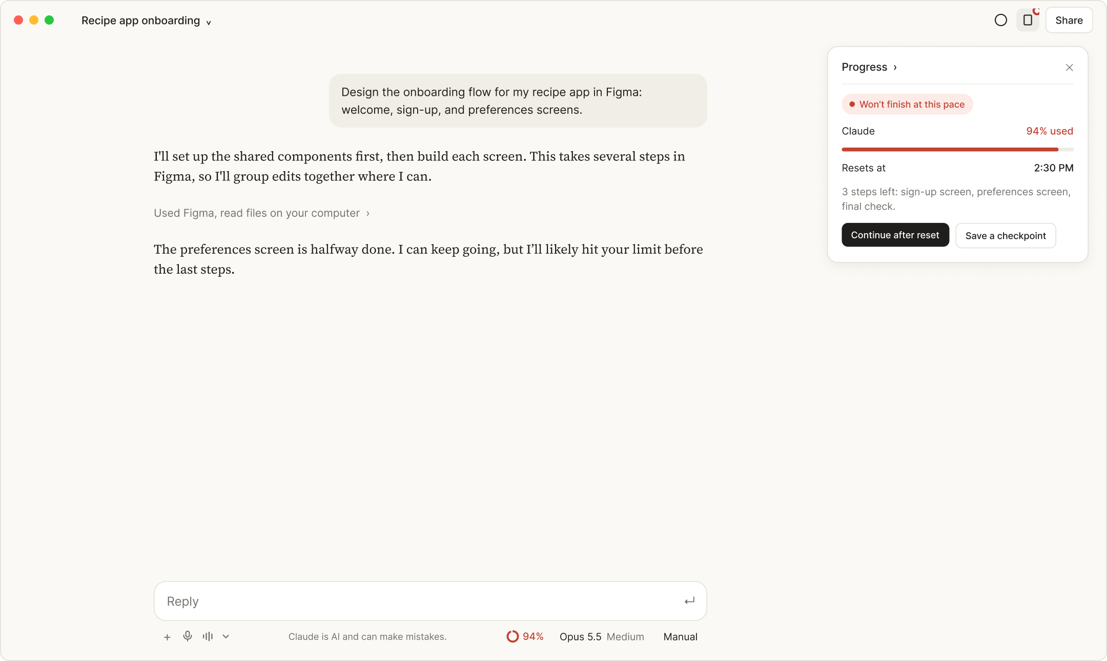
One panel tracks every tool the agent calls and names the one that will run out first, including tools that don’t share usage data.
Replaces: watching the tool you’re in while a connected one runs dry.
If a task won’t finish, the agent offers to resume automatically after the reset, or to save a checkpoint now. Afterward, a receipt compares actual use with the estimate.
Replaces: an upgrade banner halfway through your work.
05 · REFLECTION
Since I started, Claude added a usage ring and a pace forecast in settings, which validated the direction. What’s still missing is visibility inside the task and choices beyond buying more. Next, I’d test whether task-level estimates earn trust, then build this into an extension to test usability.
A verdict like "Enough to finish" answers the real question, with the numbers one step away.
Validate: How accurate do estimates need to be before people trust them?
Color and prompts only when they're needed kept the meter from becoming a source of stress.
Validate: A/B test an always-on ring against one that appears past a threshold.
With agents, the limit that stops you often isn't the one you're watching.
Validate: Do people take the cheaper paths or push on anyway with a higher-cost command?
Showing a balance helps, but people need decisions, not just numbers. The strongest moments give a choice, not a warning.
Validate: Do people finish more tasks when offered choices than when they’re only warned?
Next project
Benefit Management Dashboard Redesign